First impressions no longer start at the front desk—they start online.
Before your patients shake your hand or hear your voice, they’re sizing you up based on your website. In many ways, your online presence is a digital extension of your personality and chairside manner. So, what is your website really saying about you?
Let’s explore how design choices, content tone, and user experience reflect the kind of care patients can expect in your dental chair—and how you can align your digital message with your clinical excellence.
Your Website = Your Virtual Waiting Room
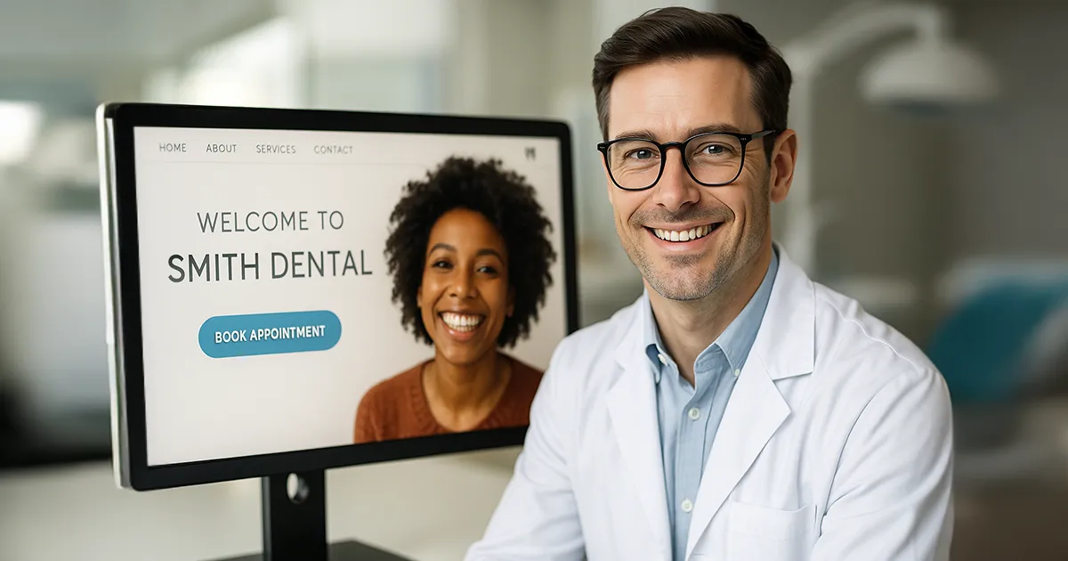
Imagine walking into a dental office where the walls are scuffed, the lighting is dim, and the receptionist ignores you. That’s how it feels when a dental website is outdated, slow, or confusing. According to a study by Stanford University, 75% of people judge a business’s credibility based on its website design (Stanford Web Credibility Project). A modern, intuitive, and empathetic site signals that you care about your patients’ experience, even before the appointment.
Design Elements That Reflect Your Chairside Manner:
| Website Trait | Patient Interpretation |
| Warm, clean colors & smiling images | “They’re friendly and approachable.” |
| Simple, intuitive navigation | “They’re organized and efficient.” |
| Professional layout & high-quality photos | “They’re experienced and detail-oriented.” |
| Mobile responsiveness & fast loading | “They value my time and convenience.” |
If your website feels cold or clunky, it could wrongly suggest that your practice is impersonal or outdated, even if your clinical care is top-tier.

Words Matter: The Tone of Your Content
The way you speak on your website is the way patients assume you’ll speak to them in person. Is your tone:
- Technical and jargon-heavy? That might make nervous patients feel intimidated.
- Warm, conversational, and reassuring? That builds trust, especially with anxious or first-time patients.
Clear, empathetic language fosters emotional comfort. For example:
“We provide compassionate care for every smile.”
Feels very different than:
“We perform comprehensive dental procedures using the latest technologies.”
Both may be true, but only one feels inviting.
👉 Want expert help crafting words that reflect your practice’s personality? Explore our Dental Marketing Services

Layout & Function = Bedside (or Chairside) Behavior
The usability of your website reflects how smooth and caring your in-person experience might be. For example:
- Can patients easily book online?
➝ This suggests a respect for their time and convenience. - Is contact information easy to find?
➝ This indicates that you’re accessible and communicative. - Are there bios and photos of your team?
➝ This humanizes your brand and helps nervous patients feel connected before they arrive.
Don’t overlook page load speed, broken links, or outdated information. These details may signal carelessness, which is the last thing patients want in a healthcare provider.

Real-World Example: Two Sites, Two Impressions
Imagine these two fictional dental websites:
- Dr. Smith’s site uses pastel colors, smiling team photos, clear services, and online booking. Testimonials are front and center. You feel welcome immediately.
- Dr. Johnson’s site has walls of text, stock images, and no clear call-to-action. There’s no mobile version. It’s hard to find contact info.
Who would you rather trust with your health?
Make Your First Impression Count
Your website doesn’t just provide information—it shapes perception. A strong digital presence:
- Builds trust with prospective patients
- Reduces appointment no-shows
- Enhances referrals and online reviews
If you’re not sure how your website is representing you, it may be time for a digital check-up.
👉 See how a custom site can match your personality and practice philosophy: Learn about our Web Design & Development Services
FAQs About Dental Website Impressions
Q: How often should a dental practice redesign its website?
A: Every 3–5 years, it is recommended to stay modern, responsive, and competitive, especially with changes in search engine algorithms and user behavior.
Q: What are the most important pages to include on a dental site?
A: Homepage, About the Doctor, Services, Contact Info, Testimonials, and Online Booking. Bonus: a blog or FAQ section helps with SEO and patient trust.
Q: Can my website help reduce patient anxiety?
A: Yes. Photos of your team, virtual tours, calming color schemes, and clear explanations of procedures all contribute to a soothing first impression.
Q: Is it worth hiring a professional agency?
A: Absolutely—especially one experienced in the dental industry. DIY websites often miss key UX and branding nuances that patients subconsciously pick up on.
Ready to Let Your Website Speak for You?
Your website is more than a digital brochure—it’s your online handshake. Make sure it reflects the kind, professional care patients will experience in your chair.
References
- Stanford Persuasive Technology Lab. Stanford Guidelines for Web Credibility.
https://credibility.stanford.edu - KoMarketing. 2015 B2B Web Usability Report.
94% of people cited web design as the reason they mistrusted or rejected a site. - Adobe. The State of Content: Expectations on the Rise.
38% of people will stop engaging with a website if the content or layout is unattractive.