Dental Website In the streaming era, your website isn’t just a static billboard—it’s your show’s pilot episode. Patients are the audience, and they’re judging whether your content is worth their time within the first few clicks. If your site is clunky, generic, or outdated, they won’t “binge” it, they’ll bounce.
So, how do you make your dental website feel like a binge-worthy series that keeps people hooked from the first scene to the final episode (i.e., the appointment booking)? Here’s how:
🎬 1. The Opening Scene: First Impressions Count
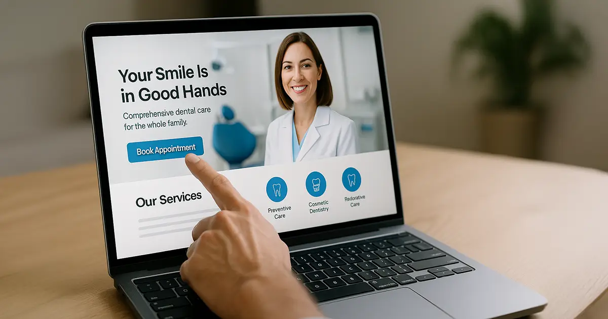
Just like a show’s first 60 seconds can make or break viewership, your homepage must deliver value instantly. This means:
- A clean, modern layout.
- High-resolution visuals.
- A clear, welcoming headline (e.g., “Gentle, Expert Dental Care in Austin”).
- Prominent calls-to-action like “Book Now” or “Meet the Team”.
👉 Ready to make your homepage irresistible? Check our web design services.

🎥 2. Storytelling: UX + Content = Emotional Engagement
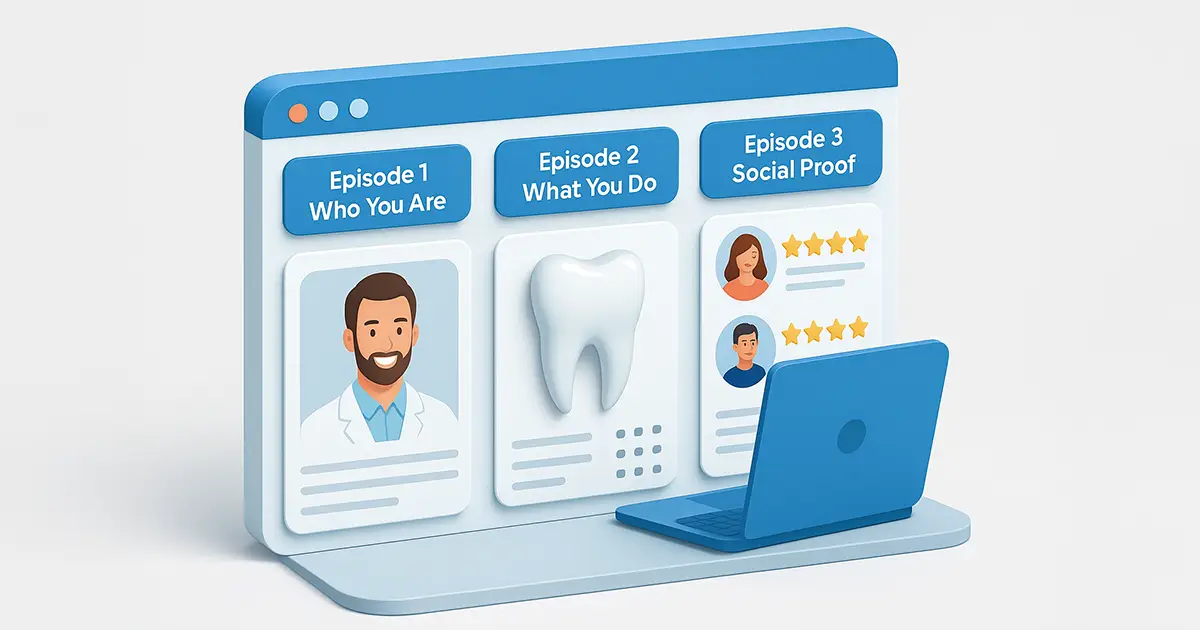
Your website isn’t just about listing services; it should tell a story. Walk patients through who you are, what you do, and why they should trust you. Structure this like episodes:
- Episode 1: Who You Are – Doctor bios with friendly, professional photos.
- Episode 2: What You Do – Explain services with visuals and simple language.
- Episode 3: Social Proof – Reviews and testimonials that reinforce trust.
👉 Want help crafting that story? Discover dental content marketing.
📺 3. Seamless Streaming: UX and Mobile Optimization
Imagine buffering in the middle of a season finale. That’s how patients feel on slow, confusing, or mobile-unfriendly sites. Make sure:
- Load times are under 3 seconds.
- Navigation is intuitive and consistent.
- All pages work perfectly on mobile devices.
👉 Don’t lose patients to poor UX. Let us optimize your site.
🎞️ 4. The Cliffhanger: Strategic Calls-to-Action
Great shows leave you eager for the next episode. Your site should do the same. Every page should guide patients toward the next step:
- Schedule a visit.
- Learn more about a treatment.
- Contact the practice.
Use CTAs like:
- “See Before & After Results”
- “Is Invisalign Right for You?”
- “Schedule Your Free Consultation”
👉 Explore CTA strategies that convert. Read more on our blog.
👉 Or take action now. Partner with TrillSites to upgrade your site.

💡 FAQs: Keeping the Audience Engaged
Q: How long should my homepage be?
A: Long enough to tell your story, short enough to stay focused. Aim for 3–5 key sections.
Q: Do dental websites really need storytelling?
A: Absolutely. Patients don’t just buy services—they buy trust and relationships.
Q: What’s the most common UX mistake dentists make?
A: Too many pop-ups, poor mobile formatting, and confusing CTAs.
Q: How do I track if patients are staying on my site?
A: Use tools like Google Analytics to monitor bounce rate, time on page, and conversion rates.
📚 References & Sources
- Nielsen Norman Group – User Attention Spans
- HubSpot – UX Best Practices
- ProSites – What Makes a Dental Website Effective
- TrillSites.com – Dental Marketing Strategies, Web Design & Development
Want your website to be a hit series, not a one-episode flop? Make every click count. Because in the world of digital dentistry, your next patient is just one binge-worthy experience away.

