In the digital age, your dental website is often the first impression potential patients get of your practice. Unfortunately, even the most visually appealing sites can hide “silent red flags” — subtle issues that subconsciously drive visitors away. Let’s uncover four common website pitfalls that may be silently hurting your patient conversions, and how to fix them.
1. Fake or Overused Stock Photos
While high-quality visuals are essential, generic stock images, especially those with models that don’t represent your actual team, can erode trust. Patients are looking for authenticity. When they see obvious stock photos, they may question whether your practice is real, professional, or even local.
💡 Fix it: Use real photos of your staff, office, and patients (with consent). Show your personality and create a sense of familiarity before the patient even walks in.
👉 Want a dental website that truly reflects your brand? Explore custom dental web design solutions here.

🚩 2. Annoying or Aggressive Pop-Ups
Pop-ups can be useful, but when done wrong, they’re irritating. If a visitor is bombarded with multiple pop-ups before they’ve even read your homepage, chances are, they’ll bounce. This is especially problematic on mobile devices.
💡 Fix it: Use pop-ups strategically. One well-timed, value-driven pop-up (like a first-visit discount or downloadable dental guide) is far better than several loud interruptions.
🚩 3. Unclear Pricing or Hidden Fees
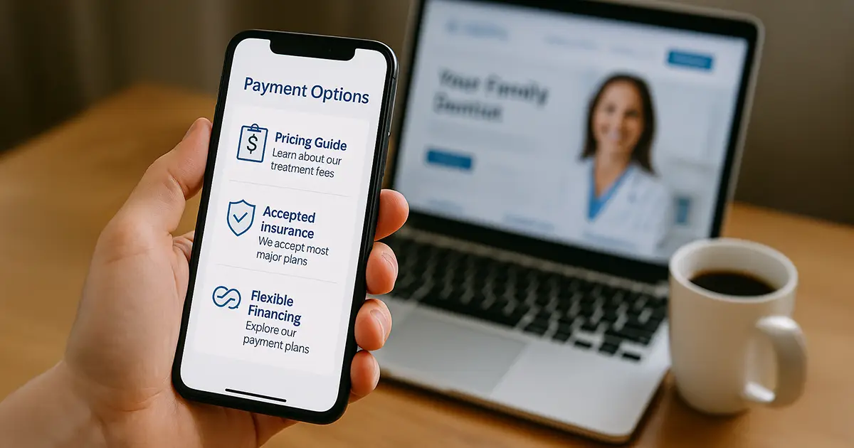
One of the biggest anxieties new patients face is the cost of treatment. If your website is vague about pricing or doesn’t address insurance or financing options, patients may assume your services are unaffordable or not transparent.
💡 Fix it: While you don’t need to list every procedure’s price, offering a pricing guide, mentioning accepted insurance, or even explaining your payment plans builds trust.
👉 Learn how your site can educate and convert patients effectively with smart dental marketing.

🚩 4. “Request Appointment” Buttons With No Immediate Confirmation
Many websites include a “Request Appointment” button, but the experience falls flat when patients click it, submit a form, and receive no confirmation or next steps. In today’s fast-paced world, people expect instant feedback.
💡 Fix it: Integrate real-time booking tools or at least confirm receipt of the request immediately and clearly explain what happens next.
👉 Want to improve patient conversion on your website? Read more tips on our dental blog.
What Should a Great Dental Website Include?
To avoid these silent red flags, your website should focus on clarity, trust, and user experience. Here’s what patients actually want to see:
- Real images of your team and practice.
- Clear, friendly language.
- Easy navigation.
- Transparent services and pricing.
- Visible contact info and booking options.
- Fast-loading pages on mobile and desktop.
👉 Ready to upgrade your dental website? Partner with TrillSites.com for smart web solutions.
Frequently Asked Questions (FAQs)
Why do patients leave a dental website quickly?
Because of poor user experience, slow load times, lack of trust (e.g., fake photos), confusing pricing, or no clear next steps.
Should dental websites list prices?
You don’t have to list everything, but being upfront about common costs or offering a downloadable pricing guide builds trust.
How can I get more appointments through my website?
Ensure your “Book Now” button is visible, leads to a real-time scheduler or confirms the request, and follows up via email or SMS.
Can I use stock photos on my dental site?
It’s better to use custom, professional photos of your own team. Patients want to see the real people they’ll be trusting with their care.
References & Sources
- Nielsen Norman Group – Pop-up UX Research
- Smile Marketing – What Patients Look for on a Dental Website
- HubSpot – Web Conversion Benchmarks
- TrillSites.com – Dental Website & Marketing Services

